

Ever wondered why dark mode is set on one phone out of every two?
Think…you are lying in bed, scrolling through your phone at midnight. You open an app and suddenly the bright white screen glares at your eyes. What is the very first thing you do? You reach for the dark mode toggle UI.
That instinct has become universal. The dark-themed mode is no longer a quirky feature exclusive to a handful of apps. It is now a central expectation of modern digital experiences. Phones, desktops, apps, websites, and even cars have integrated dark mode settings because users demand it.
But the conversation goes deeper than comfort. Designers still argue about whether a dark UI or a light one is more readable. Developers analyze battery impact and performance. Brands look at modern web design trends to see how they can stay relevant. The truth is not about picking sides. The real answer lies in offering a choice that balances accessibility, performance, and preference.
Scrolling down, we will look at what dark mode design really is, why it affects the way we feel when we use a product, and how a web design agency or developer handles the ongoing dark mode vs light mode debate. We will also dig into the mistakes that often get overlooked and the practical steps that make dark themes work well.
TL;DR: Dark Mode Key Highlights
- Dark mode means darker surfaces with light text, making interfaces easier on the eyes in dim spaces
- It boosts content focus, saves battery on OLED devices, and feels modern
- Light mode vs dark mode is not about winning. Both matter in different contexts
- A visible dark mode toggle design is essential for usability
- Common web design mistakes, like pure black backgrounds, weak contrast, and hidden toggles, ruin the experience
- Case studies such as Google Discovery dark mode show the value of subtle design
- UI/UX best practices include contrast ratios, brand color adjustments, and state clarity
What Is Dark Mode Really About?
So, what is dark mode? Think of it as flipping the usual formula. Instead of a bright white or light background with dark text, you switch to darker shades like charcoal, gray, or black, and let the text and icons glow brighter. That shift creates a very different mode of design.
But here is where many go wrong. Dark-themed mode is not just a “color inversion.” Shadows behave differently on dark backgrounds, and vibrant brand colors can look jarring if you do not adjust them. Even text that looks perfect on white can look washed out against black. These are the things that make a web design firm or the best web development agency really ‘BEST.’
Take Apple, for example. Their guidelines suggest using dark gray instead of pure black because it feels softer and gives a sense of depth. Google’s Material Design team recommends tonal overlays instead of shadows to create that same sense of elevation. These sound like small tweaks, but together they make a dark mode website feel comfortable and natural instead of flat or harsh.
The Psychology Behind The Comfort Of Dark UI
Why does a dark UI feel so different from a light one?
It’s the game of psychology here.
Dark settings immediately create a sense of focus and intimacy. Think about entering a cinema. The dim environment makes you ignore the surroundings and focus on the screen. In digital design, dark-themed websites achieve the same effect. Photos pop, videos feel cinematic, and dashboards become more immersive.
This explains why Spotify, Netflix, and YouTube rely heavily on dark design. Album covers, video thumbnails, and graphics all feel sharper and more engaging. It is not only about saving energy. It is about shaping how people feel when they interact with the product.
Still, studies reveal an important limitation. Long passages of text are easier to read in light settings. Readers skim faster and make fewer mistakes when backgrounds are bright. That is why platforms like Google Docs or e-readers often use light defaults.
Even a web development company understands that adding a night-friendly option levels up the performance and versatility. The insight is clear. Use dark-themed design for visual-heavy, immersive experiences. Use light themes for text-heavy content. The wisest move is to provide both options.
The Ongoing Dark Mode Vs Light Mode Debate
Users are passionate about the dark mode vs light mode debate. Both sides have strong arguments.
- Dark-mode supporters claim it reduces eye strain, looks modern, and extends battery life on OLED screens. Many simply prefer the cool, sleek look of a black website.
- Light-mode defenders point out that it is easier to read, especially during the day or in bright spaces. It feels traditional and reliable for professional settings.
Battery life plays a big role in the argument, too. Google once pointed out that YouTube used 40 percent less energy in darker settings on OLED phones.
Also, researchers at Purdue University tested Android devices like the Pixel and Moto Z3 to measure how much battery savings really come from a darker display. The results were pretty striking: at full brightness, switching to a darker theme cut power use by about 42 percent. At 50 percent brightness, the savings dropped to around 9 percent, and at 30 percent brightness, it was closer to 3 percent.
So which mode wins? Neither. Context decides. Nighttime browsing favors dark themes. Office reading favors light. The smartest design choice is flexibility through a dark mode toggle UI.
Why People Gravitate Toward Dark Themes
There are many reasons why users lean toward dark mode design:
- Visual comfort: Soft on the eyes, especially at night
- Highlighting content: Images, videos, and charts look sharper
- Battery efficiency: OLED devices consume less power
- Stylish feel: Darker surfaces create a modern, premium look
It is interesting to note how psychological preference adds another layer. Many users claim they feel more focused or creative when they use dark UI. This explains why creative professionals and coders often prefer working on dark mode websites or apps.
When Dark Theme Websites Work Best
Dark mode websites are not a must-have for every platform. Sometimes they fit perfectly, and sometimes they just get in the way. It all depends on what the product is trying to do.
Take creative portfolios, for example. A darker background makes artwork, photos, or designs stand out in a way a white canvas never could. The same goes for streaming platforms like Netflix or YouTube. A dark backdrop turns the screen into more of a theater experience, which is exactly the feeling those platforms want to create. Even music apps like Spotify have leaned into dark UI because album covers and waveforms feel richer when the interface is toned down.
Dashboards and analytics tools also benefit because charts and data visualizations instantly pop against dark surfaces. And if you ask any developer, they will probably tell you that coding for hours feels far easier in a dark environment than with a bright, glaring white editor.
Now flip the scenario. If you are working in Google Docs or an office suite all day, a lighter screen makes more sense. Reading and editing text for hours on a dark background can get tiring. Educational platforms face the same issue since students spend a lot of time reading. Long-form reading apps usually do better with light backgrounds, too, and if you are outside in sunlight, dark themes become almost unreadable.
Businesses now even ask for UI UX packages that cover both themes from the start, because users expect flexibility no matter what device or platform they are on. So instead of asking, “Which is better: dark or light?” the smarter question is, “Why not both?” Giving people the option to switch between white vs dark themes makes the experience adaptable. Sometimes people want focus and immersion. Other times, they just want clarity. Offering both is what really makes a product feel like it was designed for them.
Dark Mode Adoption: From Trends To Standard
When dark mode UI first appeared, it felt like a novelty. Today, it is standard practice.
- Apple added a system-wide dark theme in iOS 13.
- Android quickly introduced its own mode for design.
- Major apps like Instagram, Twitter, WhatsApp, and Slack followed with toggles.
An Android Authority poll showed that 81.9 percent of people use dark mode. Over 90 percent said they use it at least occasionally.
Designing A Seamless Dark Mode Toggle UI
If users are going to switch between either dark or light modes, the toggle must be flawless. A poorly placed toggle or a confusing system frustrates users.
Best practices for toggle design include:
- Place it where people expect it, such as the profile menu or settings.
- Use sun and moon icons with text labels.
- Provide Light, Dark, and Auto options.
- Show instant results with no popups or loading delays.
- Save preferences across sessions and devices.
Accessibility matters too. When someone switches, the system should announce the change to screen readers. State must remain preserved to avoid confusion.
UI/UX Best Practices For Dark Mode Design
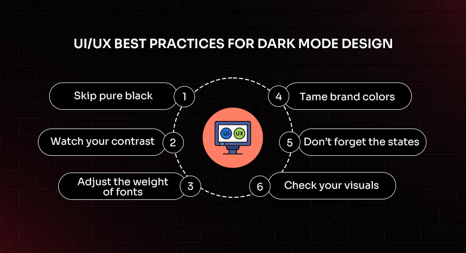
Designing a dark mode UI that actually feels right takes a bit of patience and plenty of testing. A lot of people think it is just about switching the background from white to black, but that shortcut almost always leads to problems. The details are what make it work.
Some UI/UX best practices that really help:
- Skip pure black - Go with dark gray instead. It looks softer, feels easier on the eyes, and gives more room for depth.
- Watch your contrast - Text needs to stand out clearly. A good rule is at least a 4.5:1 ratio between text and background.
- Adjust the weight of fonts - A slightly bolder typeface makes reading easier on darker surfaces.
- Tame brand colors - Bright, saturated tones that look fine on white can look harsh or even vibrate against a dark theme.
- Don’t forget the states - Hover, focus, and active states still need to be obvious; otherwise, people lose track of what they are doing.
- Check your visuals - Photos, icons, and illustrations sometimes vanish into the background if they are not adjusted.
When you follow the right dark mode design principles, the whole experience feels smooth, readable, and polished. It is not just about switching colors but about creating a balanced system that works in every situation.
What We Can Learn from Google Discovery Dark Mode
If you have ever used Google Discovery dark mode, you probably noticed how natural it feels. Google did not just flip white to black and call it a day. They treated it as a full design project, and that is why it works so well.
Instead of a flat black background, they went with layers of dark gray that create depth. Cards have soft tonal overlays, which help users separate one section from another without needing heavy borders. Text stays sharp, images stand out, and the spacing makes the whole feed easy to scroll through without feeling cluttered. Even the dividers are subtle, but the way everything is spaced gives you clarity.
The interesting part is that nothing about it screams for attention, yet it feels polished. That is the real lesson here. A dark UI that works is not about bold, dramatic choices. It is about dozens of small details, each one thought through so the whole thing feels calm, balanced, and modern.
Common Web Design Mistakes In Dark UI
Creating a dark mode website is tricky, and many teams fall into common web design mistakes:
- Overusing true black everywhere makes the screen harsh.
- Using light gray text with poor contrast.
- Forgetting to style hover, active, or disabled states.
- Overloading interfaces with bright neon colors that vibrate against dark surfaces.
- Hiding the dark-mode toggle design deep in nested menus.
Each mistake reduces usability. A dark UI that ignores accessibility or interaction states quickly becomes frustrating for users.
Where Dark Mode Fits In Modern Web Design Trends
Modern web design trends have embraced dark themes as standard. The focus is not just on looks but on giving people flexibility and choice.
- Design systems now include both white vs dark themes by default.
- Many apps offer super dark mode for OLED devices to save maximum energy.
- Brands are moving toward design tokens to manage both themes together, so changes evolve in sync.
The trend is clear. Dark themes are no longer experimental. They are now a foundation of mode for design choices in every major product.
A Practical Dark Mode Tutorial
If you are ready to design for dark, here is a high-level dark mode tutorial to get started.
- Plan design tokens: Create semantic tokens for surface, text, border, and state. Avoid hard-coded colors.
- Build palettes: Map two complete palettes to the same tokens. Light uses light surfaces and dark text. Dark uses dark surfaces and light text.
- Check contrast: Adjust opacities and weights to ensure clarity.
- Respect system defaults: On the web, follow OS settings. On mobile, use platform appearance APIs.
- Offer a toggle: Provide an easy dark mode toggle UI for users who want manual control.
- Test thoroughly: Validate images, charts, and icons so they do not disappear.
- Prioritize accessibility: Announce state changes, keep focus visible, and test with screen readers.
By following these steps, you ensure your dark mode design feels intentional rather than rushed.
Designing With Visitors And Scrollers In Mind
Dark mode is not just a topic of modes and themes. Take it as designing for your visitors, through the conform-angle and POV of your audience. The mode is everywhere now. Open your phone, scroll through your favorite apps, or check a new website, and chances are you will see the option sitting right there. People expect it. They do not stop to wonder whether it should exist. They just want it to feel good when they use it.
And that is the real challenge. It is not about jumping on a trend; it is about asking, “Does this feel natural to the person holding the screen?” Do they have the freedom to switch between either dark or light without digging through endless menus? Can they still read comfortably without squinting? Does the interface respect their comfort in both bright daylight and midnight browsing?
Those details matter more than showing off a “cool” look. When dark mode UI feels smooth, clear, and simple, people appreciate it even if they never say it out loud. Any good UI/UX design agency knows that dark and light themes are not about picking favorites. They are about giving people choices and making sure both options feel equally natural.