
Building your first website? It’s exciting, but it’s also weirdly easy to mess up and make web design mistakes. One bad decision and suddenly your homepage looks like it time-traveled from 2005, and not in a cool way.
That’s because web design isn’t just about throwing text and images onto a screen. It’s about creating something that feels clear, easy to navigate, and worth someone’s time. And when you’re new to it? You’ll trip into some common traps fast.
This guide breaks down the common website mistakes in designing that first-timers make, the ones that turn potential customers into instant bounce stats. We’re talking about clunky navigation, design overload, painfully slow load times, and copy that sounds like it was ripped from a 90s instruction manual.
If you want your site to look like it belongs in 2025 (and not be featured in a “worst design fails” thread), read on. These are the mistakes to avoid, and the fixes that’ll make your site actually work.
Why First-Time Web Designers End Up Making Web Design Mistakes?
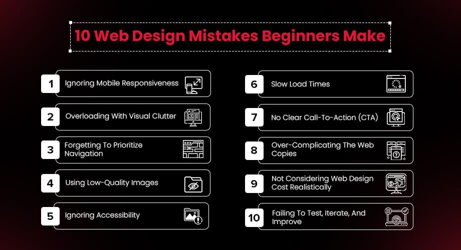
The idea of building your own website sounds simple enough: pick a template, add your content, hit publish. But somewhere between customizing that hero section and setting up your nav bar, things start to unravel.
You end up with buttons that won’t align, text blocks that look off no matter what you try, and a homepage that loads slower than expected. This is where a lot of people run into common web design mistakes without realizing it.
First-time designs often go wrong in the same places: poor mobile layout, overloaded visuals, confusing navigation, or trying to cram too much into a single page. And when that happens, the user experience takes a hit. People leave, scroll past, or get confused, even if your content is solid.
Good design isn’t about fancy fonts or flashy elements. It’s about guiding someone from the moment they land on your page to the action you want them to take, clearly, smoothly, and without friction.
If you're relying on random color choices, mismatched design elements, or trial-and-error layout fixes, you're not alone. But that’s exactly why this list exists: to help you catch what’s easy to miss and avoid mistakes before they cost you time, money, or credibility.
1. Ignoring Mobile Responsiveness
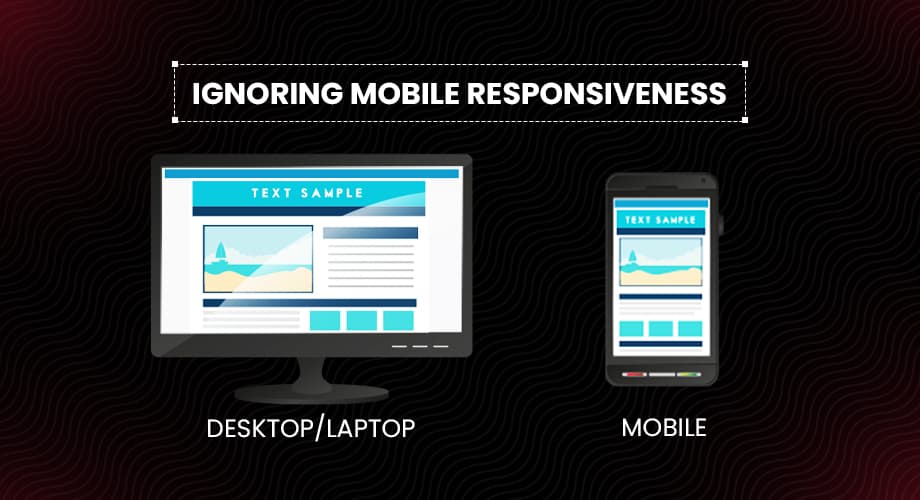
If there’s one thing you don’t want to overlook, it’s mobile responsiveness. One of the most common web design mistakes! In 2025, more than half of all web traffic will come from mobile devices. That means if your site isn’t designed to work well on a phone or tablet, you’re likely losing visitors before they even scroll.
Web design trends have long embraced mobile-first approaches, and for good reason. Google ranks mobile-friendly sites higher, and users stay longer when they can actually tap the buttons without a magnifying glass. Whether you’re DIY-ing or hiring a web development agency, make mobile responsiveness a top priority.
2. Overloading With Visual Clutter
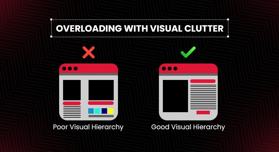
Remember: just because you can use 12 fonts doesn’t mean you should. Overdesigning is one of the classic website design mistakes that sends users fleeing. If your homepage looks like a Times Square billboard mashed with a Picasso painting, it’s time to declutter.
Whitespace is your friend. Use it generously. It makes your site feel modern, breathable, and professional. Simplicity doesn’t mean boring; it means your users can actually find what they came for.
3. Forgetting To Prioritize Navigation
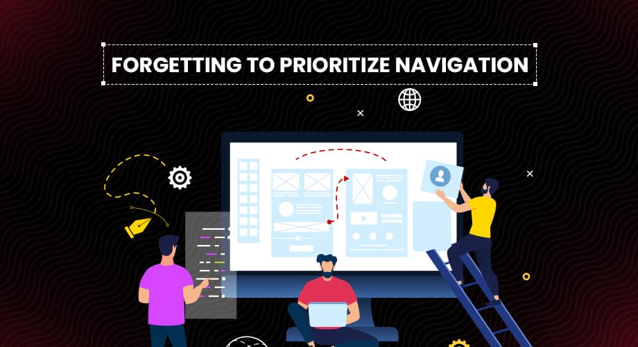
Hand your website to a friend and see if they can find your pricing page in under five seconds. If not, you’ve just discovered one of the top website design mistakes.
Navigation isn’t just about menus; it’s about creating a logical journey for your users. Stick to intuitive layouts, clear headings, and don’t bury your CTA three pages deep like it's a national treasure.
4. Using Low-Quality Images
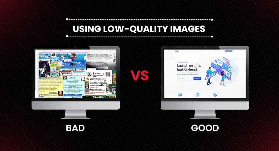
Image with comparison of low vs high quality images on the website
Pixelated headshots and grainy stock photos? Big nope. Your website is your brand’s digital storefront. Would you hang blurry flyers in your physical shop window? Didn’t think so.
Invest in high-quality visuals, or better yet, original photography. A web development agency with an eye for design will know exactly how to integrate imagery that reflects your brand and doesn’t scream "clipart from 2003."
5. Ignoring Accessibility
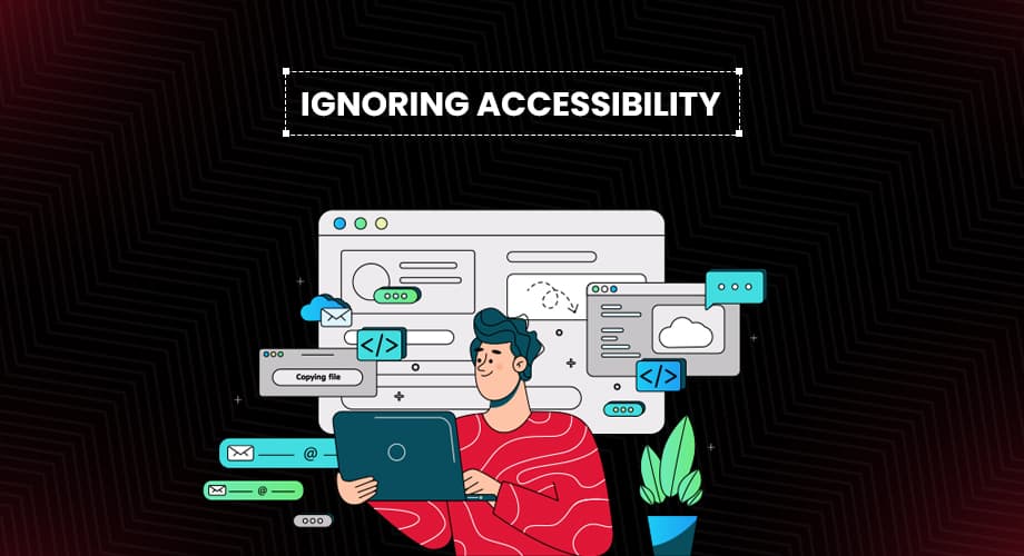
If your website doesn’t accommodate users with disabilities, you’re missing out on a massive audience and potentially violating legal standards. Accessibility is a must, and ignoring it is one of the biggest web design mistakes.
Ensure color contrast meets standards, add alt text to images, and make your site navigable via keyboard. These aren’t just tech checkboxes; they’re core to inclusive, modern design.
6. Slow Load Times
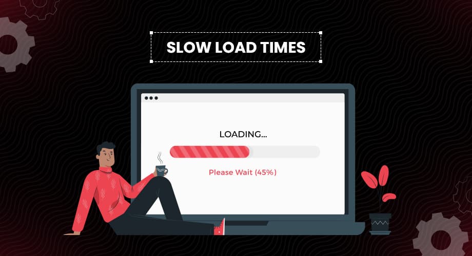
Patience may be a virtue, but your users don’t have it. If your website takes longer than three seconds to load, you’re losing visitors (and possibly your sanity trying to figure out why).
Optimize your images, use caching, and keep unnecessary scripts to a minimum. It’s one of the most common website mistakes, and yet so avoidable with the right tools and know-how.
7. No Clear Call-To-Action (CTA)
A beautiful website without a clear CTA is like a fancy restaurant with no menus. What do you want your visitors to do: buy a product, sign up, or call you? If that isn’t instantly obvious, you’re making one of the critical web design mistakes.
Your CTA should be loud and proud. Use contrasting colors, direct language, and place it where it naturally draws attention. Don’t make users hunt for it like it's a hidden treasure.
8. Over-Complicating The Web Copies

Unless your target market is composed exclusively of legal scholars, ditch the jargon. One of the most overlooked web design trends today is actually…human-sounding copy. Your users want to understand what you do and why they should care, in plain English.
Break up text with headers, bullet points, and images. Keep it conversational and skimmable. Your website isn’t your dissertation; it’s your elevator pitch.
9. Not Considering Web Design Cost Realistically
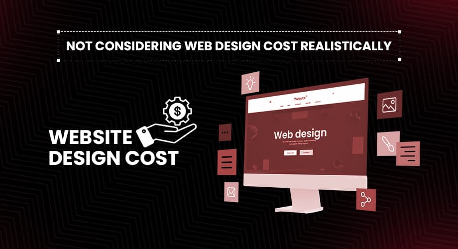
Ah, the eternal question: how much should your website cost? Short answer, enough to not make any of these web design mistakes. Trying to cut corners on the budget often leads to poor design, buggy performance, and unhappy users.
A smart approach is to consider web design cost as an investment. A well-designed site pays off in conversions, customer trust, and fewer headaches. Many web development agencies offer packages that balance quality and affordability, so do your research.
10. Failing To Test, Iterate, And Improve
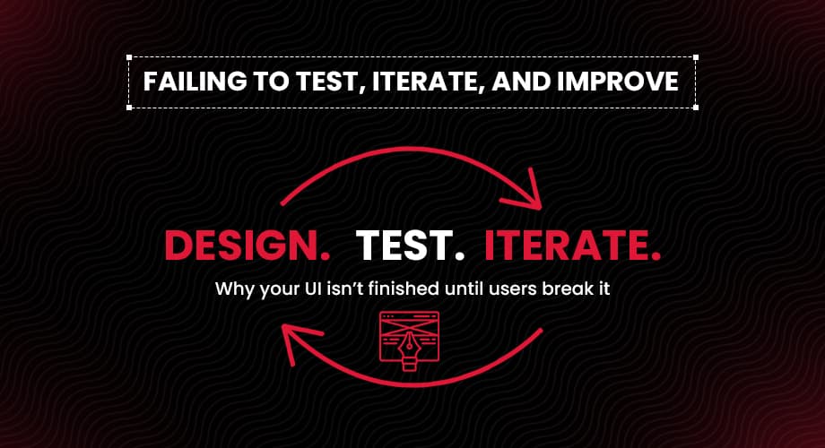
Even the slickest websites need tweaking. What worked six months ago might not be converting today. Not testing your site’s performance or user behavior is a silent killer.
Use analytics tools, heatmaps, A/B testing, and user feedback to make iterative changes. Web design isn’t a one-and-done deal; it’s a process. Embrace it.
Wrapping It Up
Designing your first website should be exciting, not a minefield of common website mistakes. Yes, the web design process has a learning curve. But if you can sidestep these 10 faux pas, you’ll be well ahead of the curve.
Keep in mind: the best website development tools and web development platforms won’t save you from a bad user experience. It’s all about the strategy, the simplicity, and a little help from those who’ve been around the block, like a seasoned web development agency that knows what to avoid.
So take a deep breath, grab your design mood board, and maybe, just maybe, use this list as your website’s safety net. Because nothing says "professional" like a site that doesn’t crash, confuse, or repel its users.
Avoid these website design mistakes, and your digital presence won’t just exist, it’ll thrive.